Show it clearly: illustrating a report for your community partners
Part II: How to design figures that tell your story.

Question:
I’m completing a multi-year participatory research project with a coalition of tenant advocates and housing-precarious residents — some with professional backgrounds in law, policy and community organizing; others bringing expertise rooted in lived experience. They’ve shaped my research questions, challenged my assumptions and pushed back on my interpretations throughout the project. Now I owe them a final report, but I’m not sure how to write for them. Unlike our previous communications, a report feels fixed and permanent. These are sophisticated readers, but they aren’t academics, and I’m worried that a report that would satisfy my scholarly peers will fail the people who made the research possible. How do I communicate findings effectively to readers like these?
— Anonymous, Urban Planning
Dr. Editor’s response:
It’s understandable, dear letter-writer, that you feel stressed about producing a document that you can’t tweak, revise or improve. There’s a lot at stake here, and that’s why I’ve dedicated two pieces in this column to answering your question. In addition to thinking about how you write your report — the topic of last month’s piece — it’s worthwhile to consider as well as you design it, including the visuals that communicate your findings and recommendations.
To learn more, I spoke with Alana McPherson of Research Visualization Specialists, who works with academics developing community-facing reports like yours. Ms. McPherson told me that she finds that visuals in reports are “a mutually rewarding way to practice relationality, accountability and transparency with community partners,” and she offers three recommendations on how to do them well:
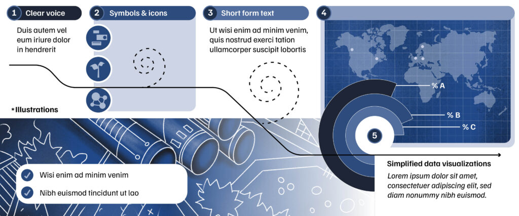
- Give your findings a sequential structure
Early in her career she worked on a project that involved researchers studying how comics can be used to improve education and engagement around ecological conservation. That work shaped how she thinks about visual communication: “If you think of comics, the layout and braiding of panels can provide an additional dimension of understanding by lending directionality to the flow of information. I apply this concept to all design challenges in my work, regardless of chosen format or design.”
Ms. McPherson encourages you to think about how your findings build upon each other, and apply that same organization to your visuals. Perhaps an early theme about power imbalances and trust sets up later findings about barriers to reporting unsafe conditions. If your visuals are a disconnected assortment of charts and images, your readers have to do the work of constructing those connections themselves. Ms. McPherson advises that you do that work for them by intentionally sequencing your visuals so that one leads into the next, the way panels in a comic strip guide a reader’s eye and attention. You might include a recurring icon or an evolving motif that can embody these connections. Before you start to design any individual visualization, sketch out the order in which your visuals will appear and ask whether that order tells a coherent story on its own, separate from the surrounding text.
- Match the finding to the form
Not every finding needs the same visual treatment, and even a single finding might need to be visualized in multiple ways to account for the diverse needs of your readership. Consider representing your findings in “illustrations, short form text, and simplified charts and data visualizations,” Ms. McPherson advises. Such a combination gives readers with different backgrounds different ways into the same result.
Consider, for example, a finding about rising rents. A line chart could show the increase over five years. Beside it, a short quotation from a tenant could describe what that increase actually meant for their household. An accompanying illustration might depict what that household gave up to cover the difference. None of these three elements replaces the others; together, they build multiple entry points into the same information.
When you lay these elements out together, Ms. McPherson recommends using a “strong visual hierarchy — a deliberate order for the eye to follow, indicated through size and placement,” so that a reader’s attention moves through the combination in an intentional sequence. You can establish a visual hierarchy by using, for example, large or bold fonts for text that the reader should look at first, and smaller fonts for supplementary details; bright colour for a page’s most important element, with muted tones for the rest; generous white space around what matters most, and tighter spacing for what’s secondary; or proximity, grouping a finding closely with the quotation or illustration that supports it, so their relationship is visually clear.”
- Anchor each visual in context
It’s easy for a chart or figure to present a number in isolation — a percentage, a trend line — without showing the reader the context in which that number appears. Ms. McPherson told me that she regularly sees researchers become “hyperfocused on the findings that are most interesting or novel scientifically, and so miss opportunities to visually highlight the larger context.” It’s a trap that you’ll need to work carefully to avoid. If you found that eviction filings rose 30 per cent, you could depict that in a line graph — but that graph would become more powerful if contextualized alongside parallel rises in average rent and utilities expenses, attesting to how multiple pressures compound.
To build context into your visuals, pair your findings with a comparison point, such as a prior year or a neighbouring jurisdiction; show where a trend concentrates geographically, if location is relevant to your findings; or connect a number to an event, like a policy change or pandemic, that coincides with it. To put it another way: your report might need to visualize context that doesn’t emerge directly from your findings — context that might be parallel to or in contrast with what you found.That’s part of centering what’s important to your readers (the big picture), rather than what’s important for you as a researcher (your novel findings).
I closed last month’s column by affirming that it can be hard for academics to write for audiences outside of academia, especially if much of your experience as a writer and a reader is in academic spaces. Effective visualization is likewise a skill that takes deliberate practice to develop and improve. Whether you build that skill yourself over time or bring in a professional illustrator or graphic designer to help you along the way, the goal will be the same as the one that has guided all your work in this report: ensuring that the people who shaped this work can access, understand, use, and — as they wish — apply the research results in ways that matter to them.
For more writing advice, see our full Ask Dr. Editor archive.



Featured Jobs
- Theatre and Film - Assistant Professor Without Review (Performance Practice)The University of British Columbia
- Director, Human Research Ethics & Strategic AdvisorUniversity of Manitoba
- KAUST Global Fellowship Program - Postdoctoral Fellowship (Call 2027)King Abdullah University of Science and Technology
- Architecture - Assistant Professor (Digital Fabrication, Design Computation, and Design/Build)Laurentian University
- Psychology - Assistant Professor (Clinical Psychology)Western University
More from Career Advice
-

Life lessons from the World Happiness Report
Happiness is a gift for elders to pass on to the younger generation.
-

Can you spot an essay written by AI?
Learn the common patterns, limitations, and clues that may reveal AI-generated writing.
-
The paradox of doctoral learning
Completing a PhD doesn’t mark the end of learning, but rather the loss of the illusion that learning ever ends.
-

The secret to good labour relations
Two negotiators — one from a faculty association, one from a university administration — share their advice for building trust and achieving the common good.
More from Writing
-

Say it plainly: Writing a report for your community partners
Part I: How to break away from scholarly style and serve the people who made the research possible.
-
Dr. Editor’s summer reading list
Five books to improve your academic writing.
-

How to write an effective service statement for your promotion and tenure dossier
Go beyond “bum-in-seat” accounting to emphasize your expertise and accomplishments.
-

What strong monographs get right
Four pre-writing steps to set you up for success.
More from Ask Dr. Editor
-

The academic’s guide to pitching for podcast interviews
Three tips for snagging a spot on your favourite series.
-

How to translate your knowledge for an industry audience
Getting buy-in from industry professionals means understanding their point of view and speaking their language.
-

How to hook an SSHRC postdoc grant
Two tips for a catchy opening that will make your proposal stand out.
-

How to craft a strategic research statement
Identifying themes in your work history can help you move from a laundry-list to a compelling story.

Post a comment
University Affairs moderates all comments according to the following guidelines. If approved, comments generally appear within one business day. We may republish particularly insightful remarks in our print edition or elsewhere.